Tradesy
Tradesy is a peer to peer marketplace for women's designer and luxury goods.
I worked as a Front End Developer and Designer, improving the usability of our Internal Tools. I led large UX projects including redesigning our Checkout & Return flows, and creating a robust and scalable Self Service solution. I also worked with the team to create our shared Design process.
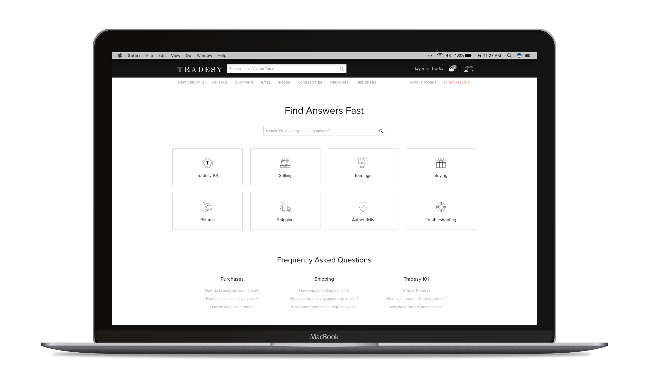
Case | Redesigning Customer Care
Our Member Care team was reaching a breaking point.
They were becoming overwhelmed with a high volume of contacts and weren't equipped with the tools or workflow needed to meet the demand. They were becoming demoralized - they wanted to do a good job and but were feeling helpless because they weren't able to.
By taking a thorough look at the problem, doing a substantial amount of research and finding the real pain points we were able to introduce a new workflow that cut down customer wait times from up to 30 minutes to less than 1 minute, and created a sustainable process for consistent customer issues to be integrated directly into our Product backlog.
Time Period
2016
Team
Amar Singh - Design Lead
Bijan Bina - Product Manager
Jeff Doan - Front End Development
Website
The Problem
When the project began, it was hard to say exactly why the Member Care team was being overwhelmed. When Tradesy was just getting started, the CEO and co-founder prided themselves on directly answering customer requests, even going as far to give their personal phone numbers.
The initial hypothesis from the Member Care team was that they needed more powerful tools, like a CRM system and more integrated information from the databases to our Internal Tools suite. Additionally, we would need to hire at least 4-5 more representatives by the end of the year in order to meet the growing demand of the business.
After starting to research and audit the team's workflow, we realized that a new CRM tool would only get us so far. We needed to completely rethink the way that our customers learned and interacted with Tradesy.
Audience
This project had two audiences with somewhat opposing objectives that we needed to balance.
The internal audience was our Member Care team. The goal was to improve and optimize their workflow, so they could provide better levels of support to our customers. For the external audience, which of course was Tradesy customers. We needed to ensure whatever solution we implemented met (and hopefully surpassed) their needs and expectations of customers.
Team + Role
I was the Lead Designer and User Experience Designer on this project and guided the Definition, Research, Ideation and Validation of the concept and process.
I worked with the Product Manager to help scope the project and constraints. Later in the project, we brought on a Visual/Front-End Designer to build the integration with ZenDesk's API and create the UI and interactions. Additionally, worked closely with stakeholders, including the Member Care team and COO.
Constraints
Budget
One way to improve Customer Service wait times is to throw more bodies at the problem, but we didn't have the budget to continue scaling our customer service team linearly with the rapid growth of Tradesy.
Customer Experience
Support teams are usually considered expenses when calculating budgets. However, in order to create an enjoyable product, it's crucial to provide a great experience to customers who may have questions, concerns or issues.
Research
Research is paramount for the success of any Design, especially to get at the root cause of any issue. I had the luxury of being able to interview member care representatives as they sat in the same office as us in Santa Monica. They were a great source of insight, and I was able to shadow a few of them to better understand how they worked.
We also needed to audit the current experience to gain a perspective of what was working and what was ineffective. I audited the different channels and response times, as well as the tools themselves. We also looked at the most common reasons as to why customers called us. We used this data and audit to identify repeatable themes that our customers had concerns or questions about. After thorough research, we came up with the following insights:
Our Customers didn't *want* to contact us
As a small start-up, you want to make it as easy as possible for your customers to contact you. It's natural to want to continue that instinct as you grow.
However, in most instances, customers contact you because they have questions or problems. They want those questions answered and problems solved. Give them the tools to answer their own questions and solve their own problems through robust self-service options. It's a faster resolution for the customer and reduces the amount of contacts for the company.
Our Tools were ineffective and outdated.
We had three disparate tools and vendors for servicing our Chat, Email and Phone contacts. What's worse is that these systems didn't talk to each other. We had no idea if the same customer had been contacting us via Chat and Email at the same time. We had separate tickets for both contacts and had to spend a lot of time resolving these discrepancies. Our Member Care team would be much more efficient if we were able to give them the context as to why users were contacting us.
Communication between Member Care and Product was broken.
While I was interviewing the Member Care team about common issues and problems, I realized that many of the issues they described weren't a problem with the team's workflow, but actual problems with the product itself. Many contacts were repeated, short questions.
Thus, our core product had areas that were confusing to customers. We needed to use these insights as an opportunity to improve the confusing flows. Essentially, the success of this initiative was that our top 5 customer contact reasons would continually change, because we would be improving and optimizing those areas of the product.
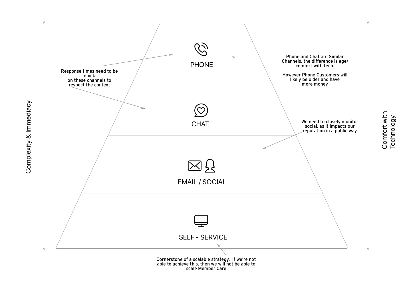
We needed a channel strategy.
Ideate
There were several outcomes and initiatives that came out from the Research for this project. We decided to move from our current tools to ZenDesk. With the help of an enterprising representative, we were able to create a sustainable process to triage and prioritize issues that came directly from our customers directly into the appropriate Product backlogs.
However, in order to really impact the workflow of our Member Care team, we needed to create a comprehensive Self Service strategy that really helped solve customer issues. Additionally, we needed to figure out a way for the customer's information to get passed to our Member Care team (without annoying the customer).
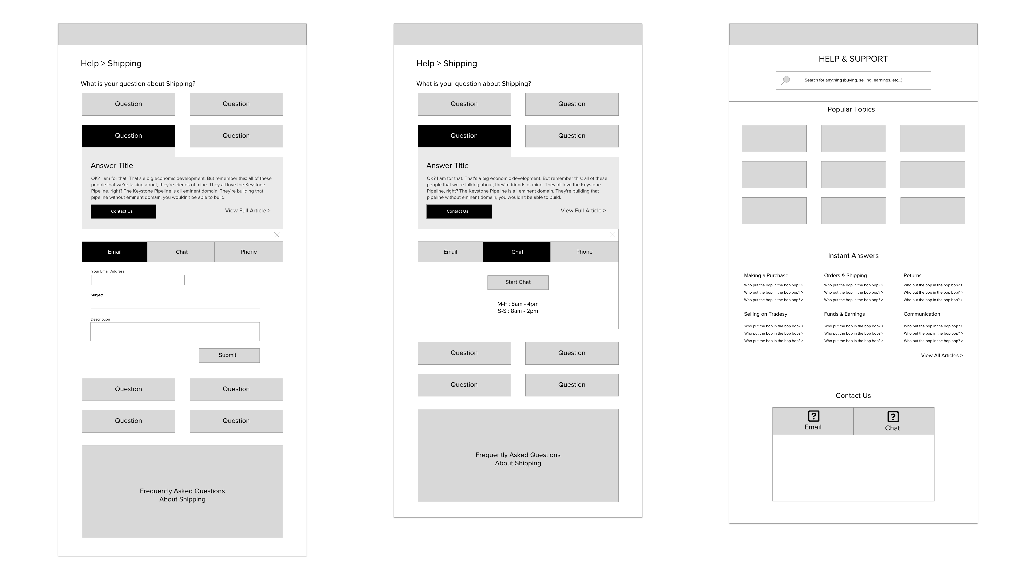
I led participatory design sessions with a few insight people from the MC team, the Product Manager and the Visual Designer. We sketched a few sessions, with a focus on broad exploration. Then we refined the few concepts we liked and shared them broadly for feedback. When we settled on the one we liked, we built a prototype.
Validate
We had one main question we needed to validate with users, "is our self-service content structured in a way our users can understand and navigate?"
In order to do this, we had to create a pretty robust content prototype, with over 100 questions and answers our users might have. We built the list using data from our most common customer complaints.
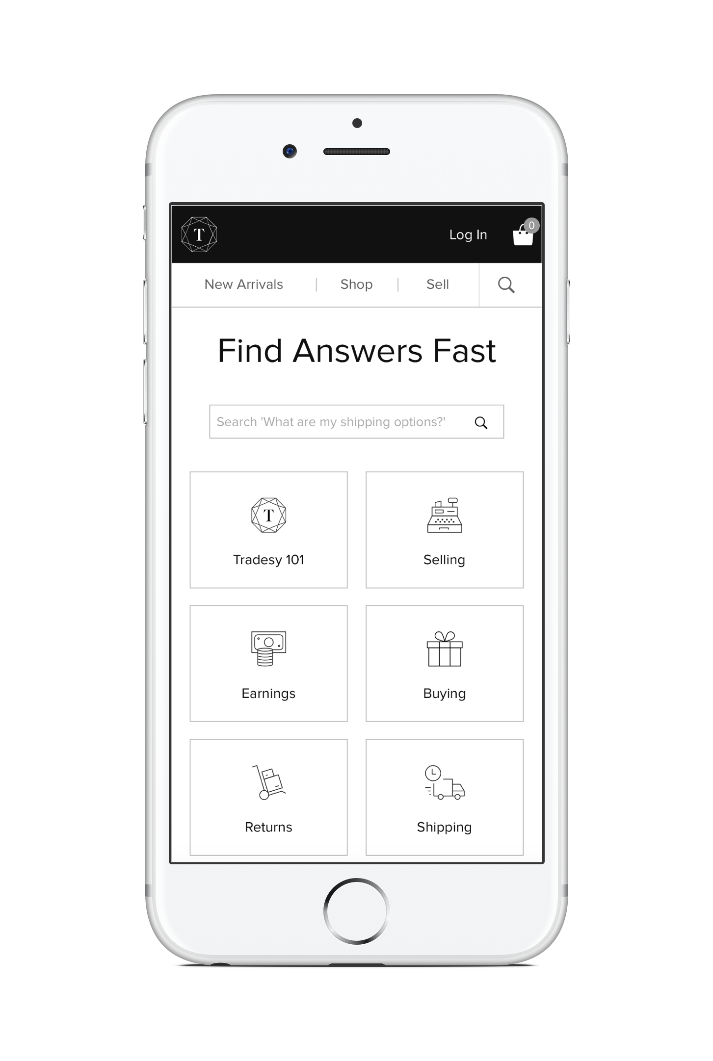
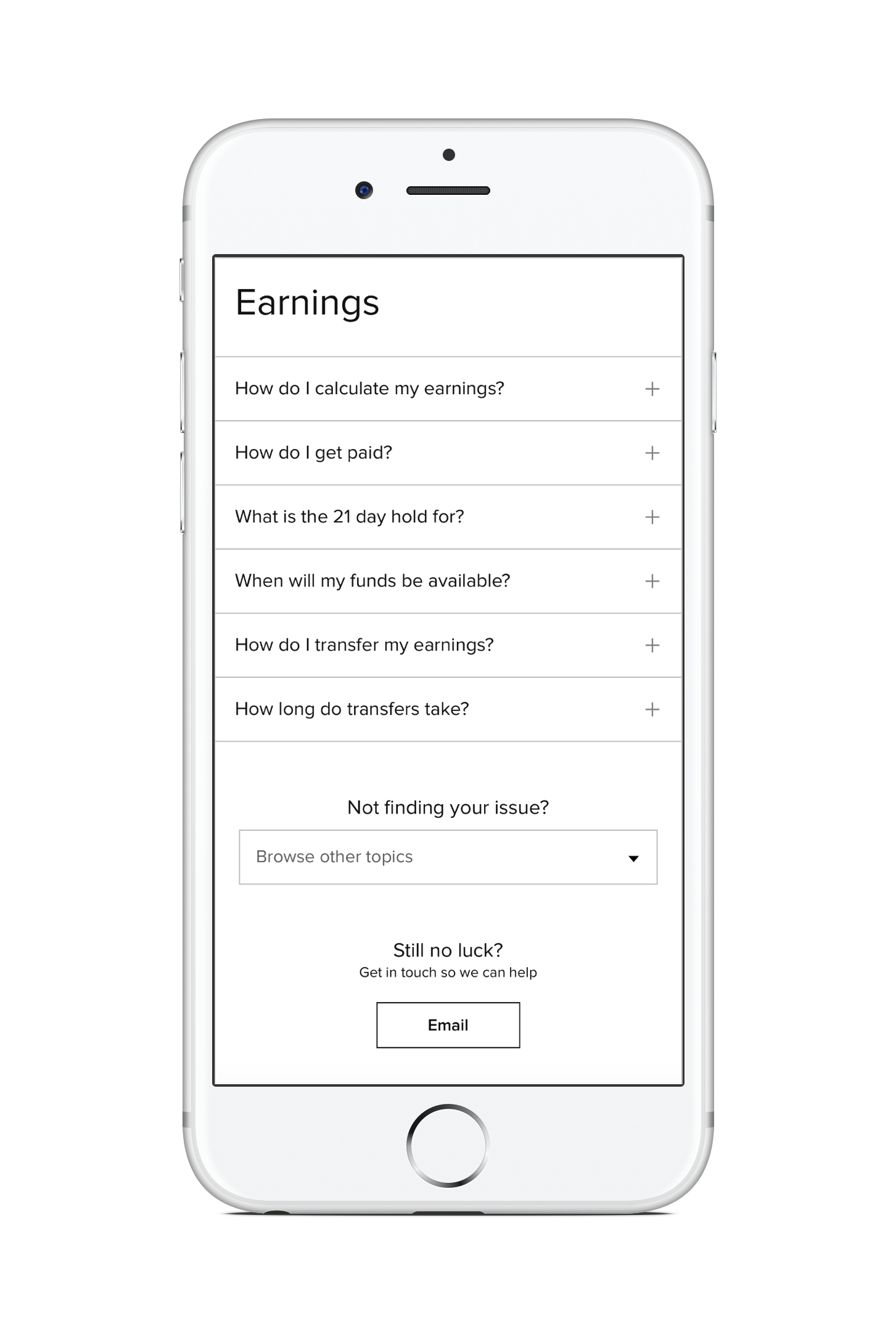
We learned that we needed to provide duplication of content. Some users will look for Shipping in "Buying" while others may think Shipping in "Account Info." When it makes sense, put it in both places. Don't make the user think more than they need to.
Execute
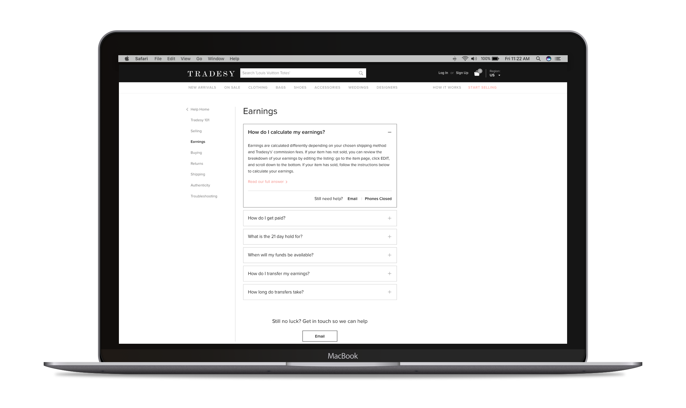
From the start of this Design process, I advocated for our self-service solution to live on our site and codebase, versus using an external site hosted by Zendesk. It's often jarring for users to be taken to a separate site, with a different design. And it also limits the ways you can integrate your self-service solutions with your core product.
This is harder to do, but it's why you invest in quality front-end developers.
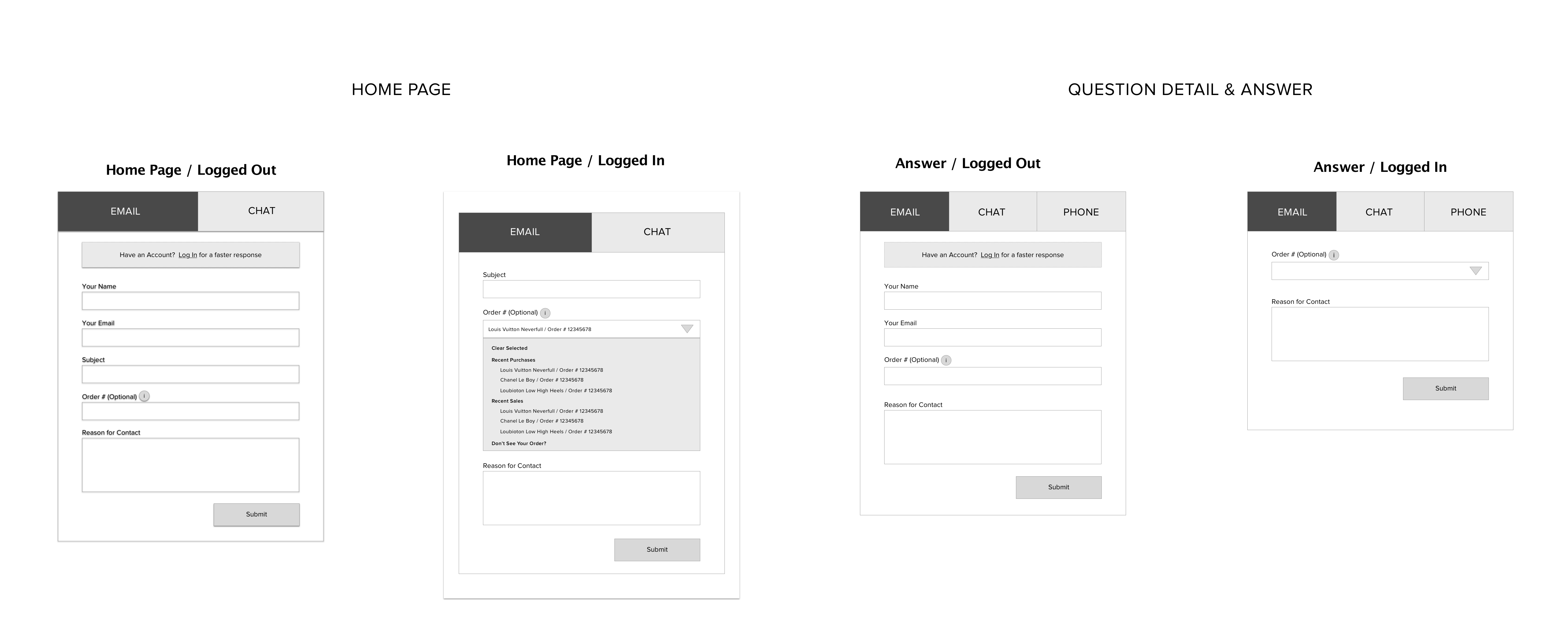
We had a beautiful, tenable solution (validated by our prototype), but it was paramount that we could make this design maintainable without having to work directly with a developer. Using Zendesk's API, we were able to maintain the content using the Zendesk back-end, which would automatically update on our front-end. We had much more control of the styling and structure of the content and we could add our enhancements, including opening hours and including things like recent orders and tracking numbers (if the user was logged in).

Outcome
The impact of this project was almost immediately seen.
We were able to reduce the wait times on phone from an average of 10 minutes to less than one, by giving customers the tools they needed to answer their easy questions. We also improved our email response time to be consistently less than 24 hours.
We wanted to ensure that the changes we made did not impact our level of service or NPS scores. In fact, we actually improved both, because users who used to have to wait for responses now were serviced faster.
Finally, we were able to solidify a sustainable process for our Member Care and Product teams to work together and prioritize and triage customer issues to the right backlogs. This is natural when you have one Product team, but needs deliberate attention and focus when you scale up to four or five teams working concurrently.